
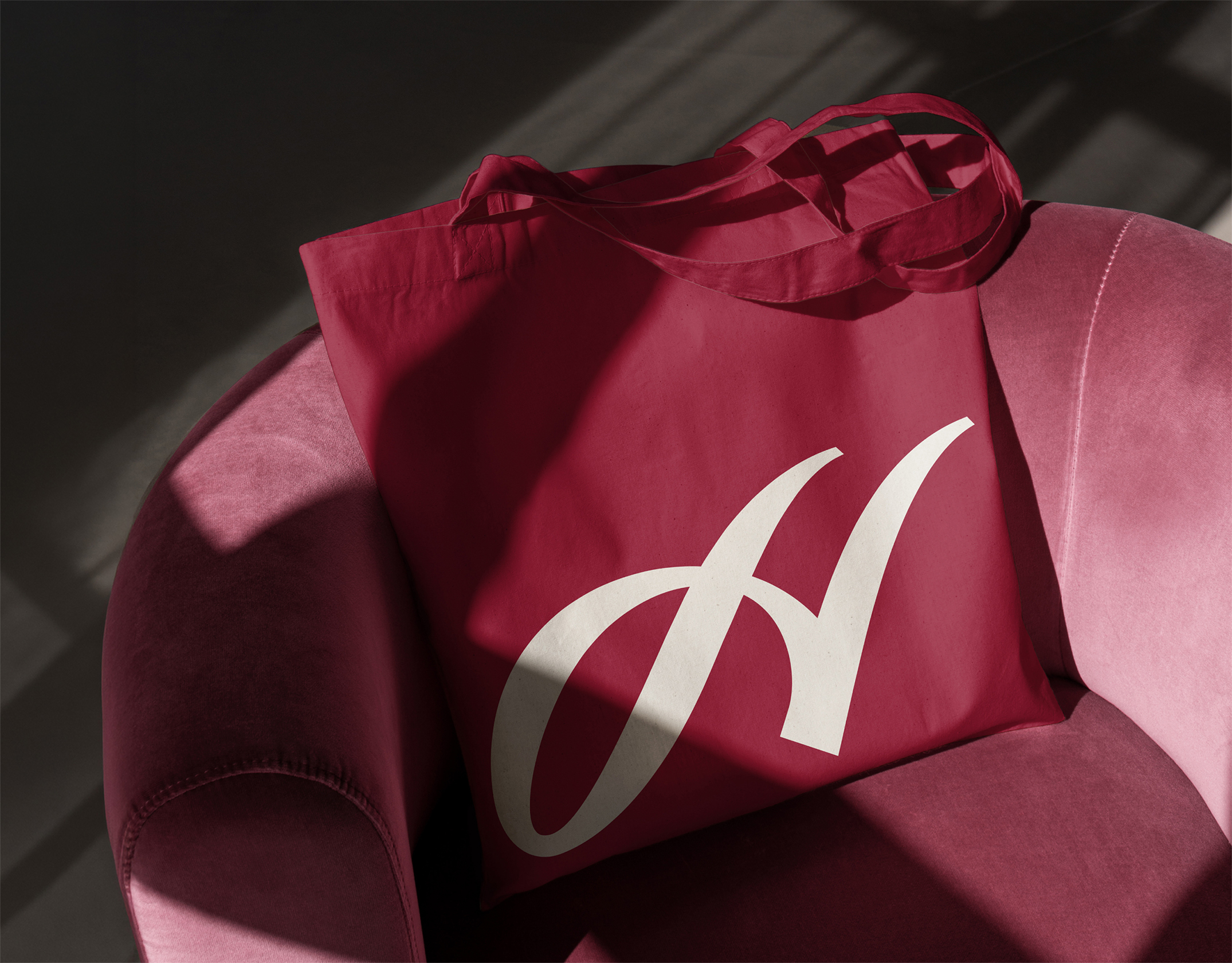
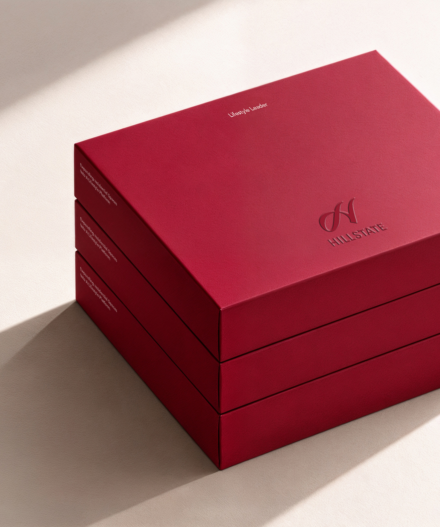
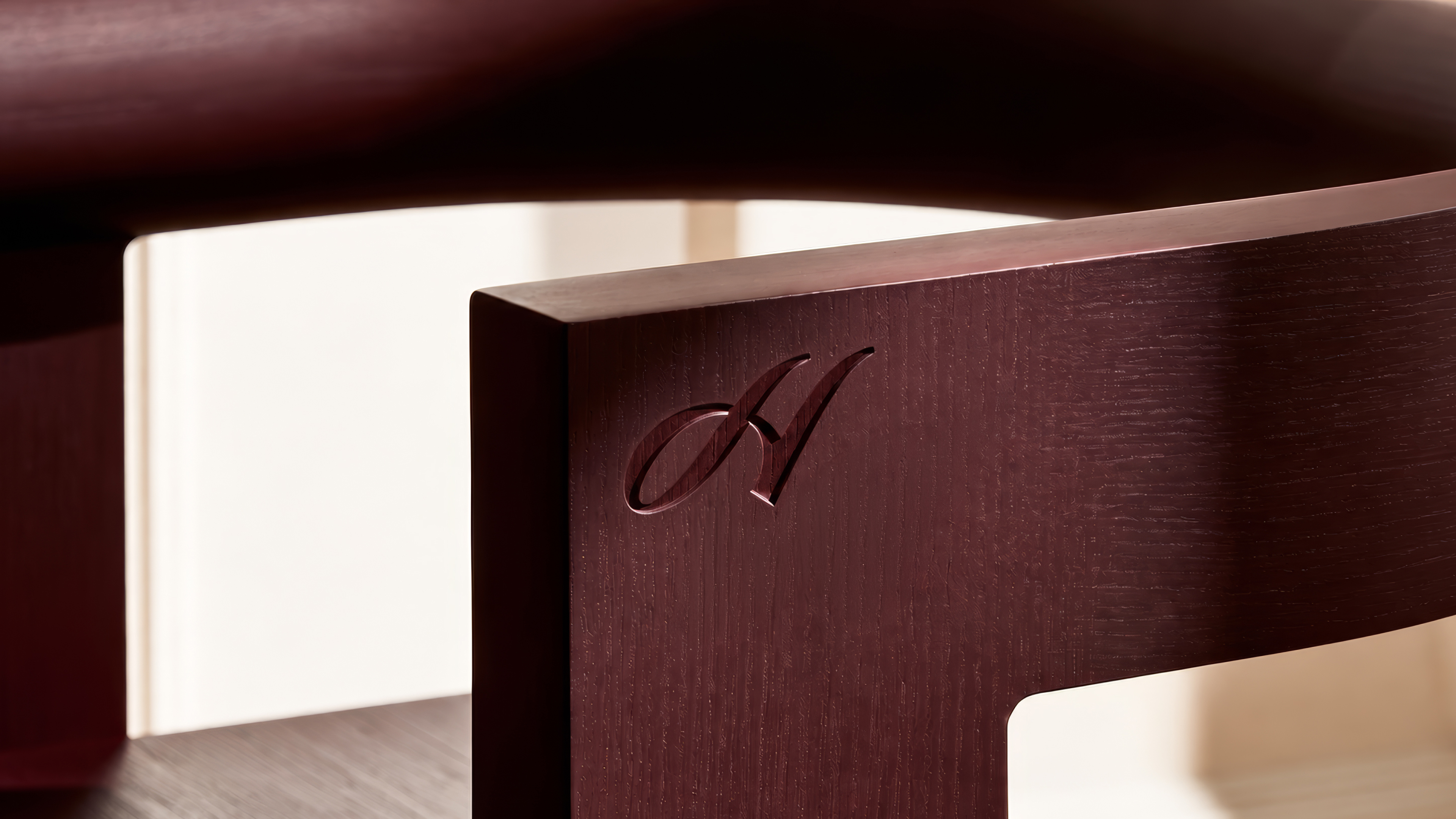
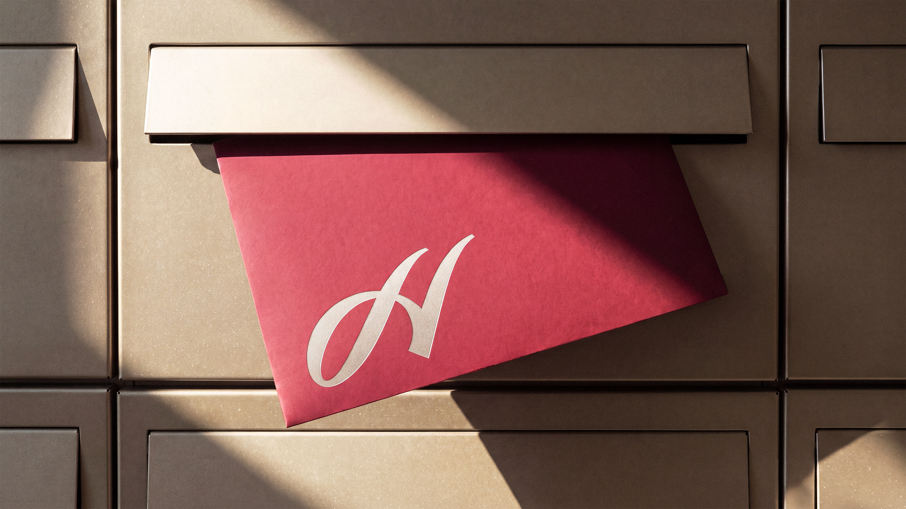
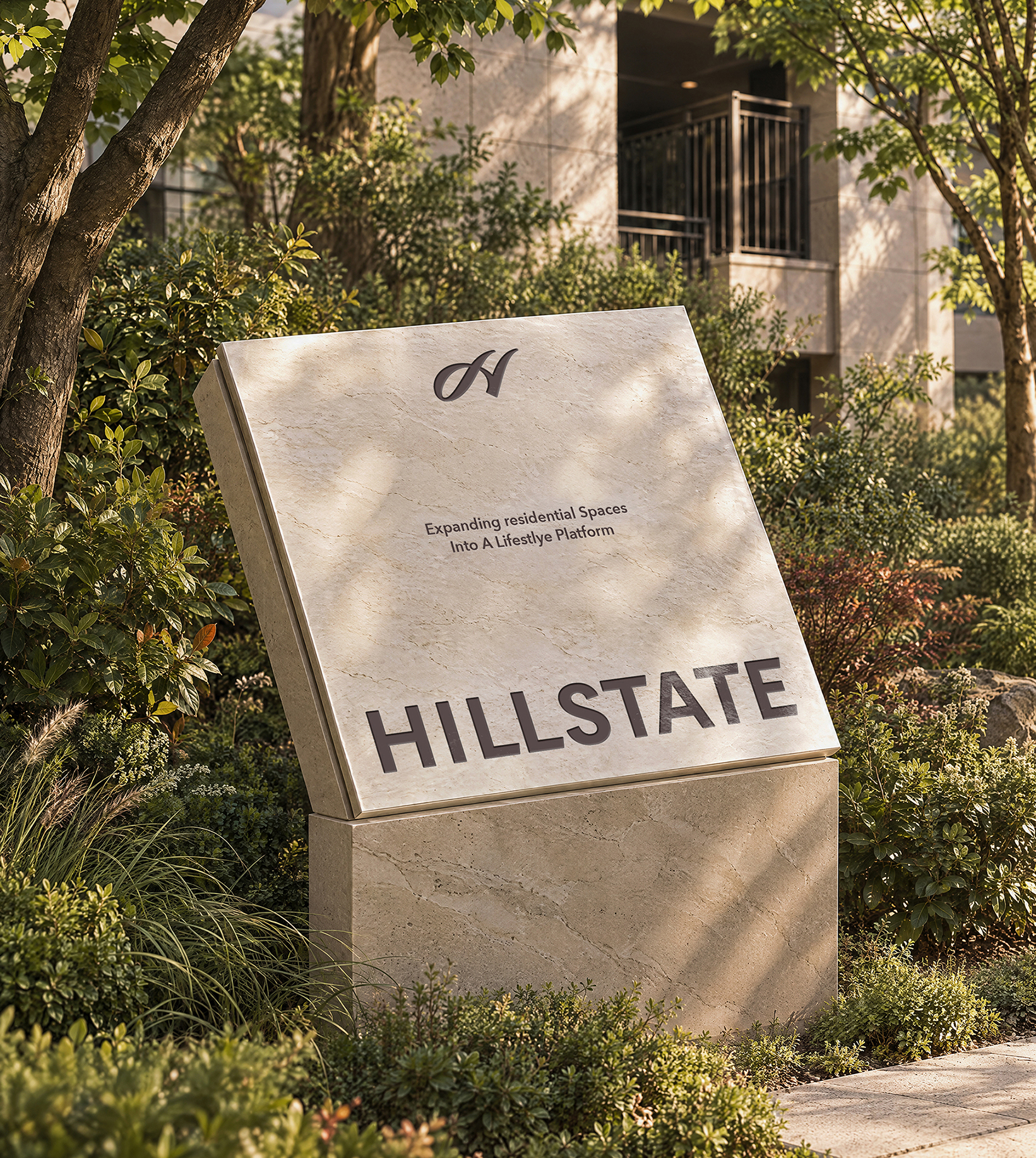
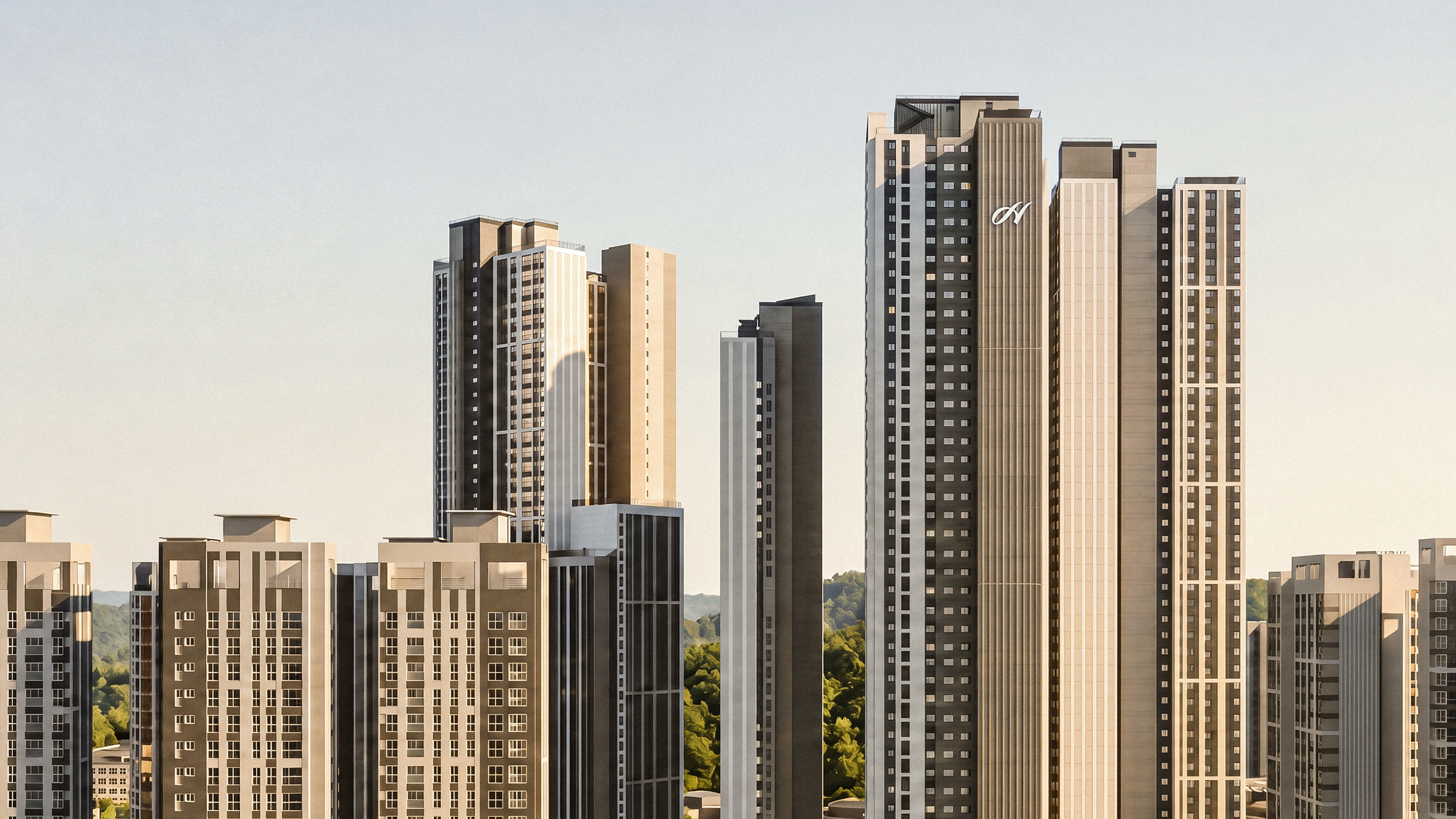
The new HILLSTATE identity builds on the symbolism and heritage the brand has established over time, redefining its form and expression with greater simplicity and refinement. Created from a single continuous line, the symbol captures a sense of uninterrupted upward movement, representing constant evolution and a higher standard of living. Its flowing arc embraces the diverse moments and spaces of everyday life, while ensuring strong visibility and a consistent brand experience across different environments. By reinterpreting long-established values through a contemporary lens, HILLSTATE expands them into a new standard for better living. Beyond housing, HILLSTATEsets a new standard for lifestyle.
새로운 힐스테이트는 기존 브랜드가 축적해온 상징성과 정통성을 계승하면서, 형태와 표현을 더욱 간결하고 정제된 방식으로 재정의합니다. 하나의 선으로 완성된 심벌마크는 끊김 없이 상승하는 흐름을 통해 지속적인 진화와 더 나은 주거의 기준을 상징하며, 유려하게 이어지는 원호는 삶의 다양한 순간과 공간을 포용합니다. 또한 다양한 환경에서도 명확한 시인성과 일관된 브랜드 경험을 구현합니다. 오랜 시간 쌓아온 가치를 현대적인 감각으로 재해석하고, 더 나은 삶의 가치로 확장합니다. 힐스테이트는 주거를 넘어 새로운 라이프스타일의 기준을 만듭니다.
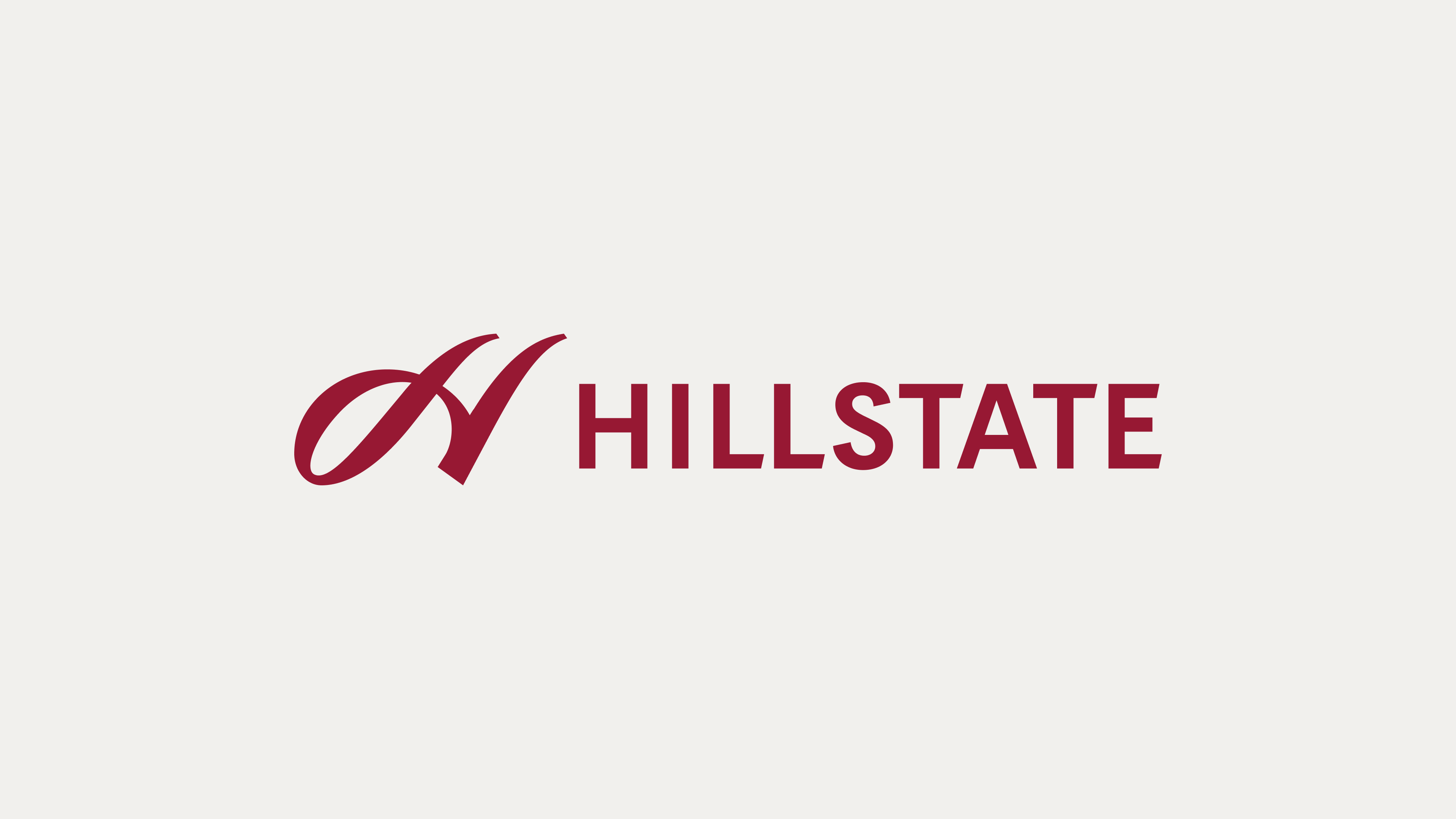


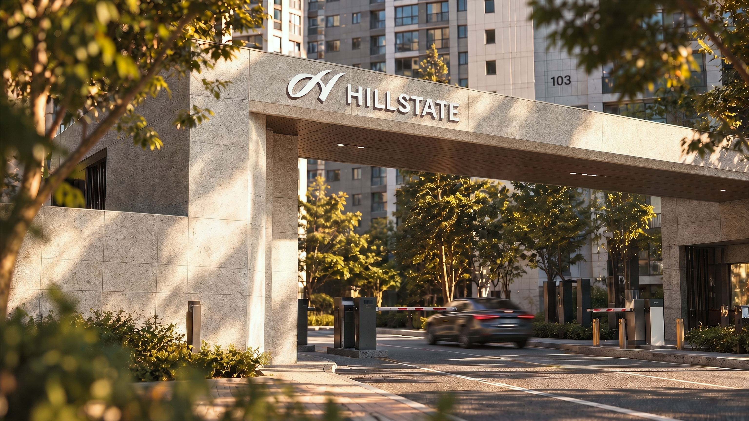
The new HILLSTATE logo builds on the distinctive characteristics of the original design, preserving the core form that embodies the brand’s identity while refining it into a simpler and more streamlined expression. The refreshed design carries forward the brand’s symbolism and heritage while enhancing visibility and adaptability across a wide range of applications.
새로운 힐스테이트 브랜드 로고는 기존 로고가 지닌 조형적 특징을 기반으로, 브랜드 정체성을 담고 있는 핵심 형태를 유지하면서 더욱 간결하고 정제된 방식으로 재구성했습니다. 기존의 상징성과 정통성을 계승하는 동시에 시인성과 현장 적용성을 높여 다양한 환경에서도 일관되게 활용될 수 있도록 디자인했습니다.
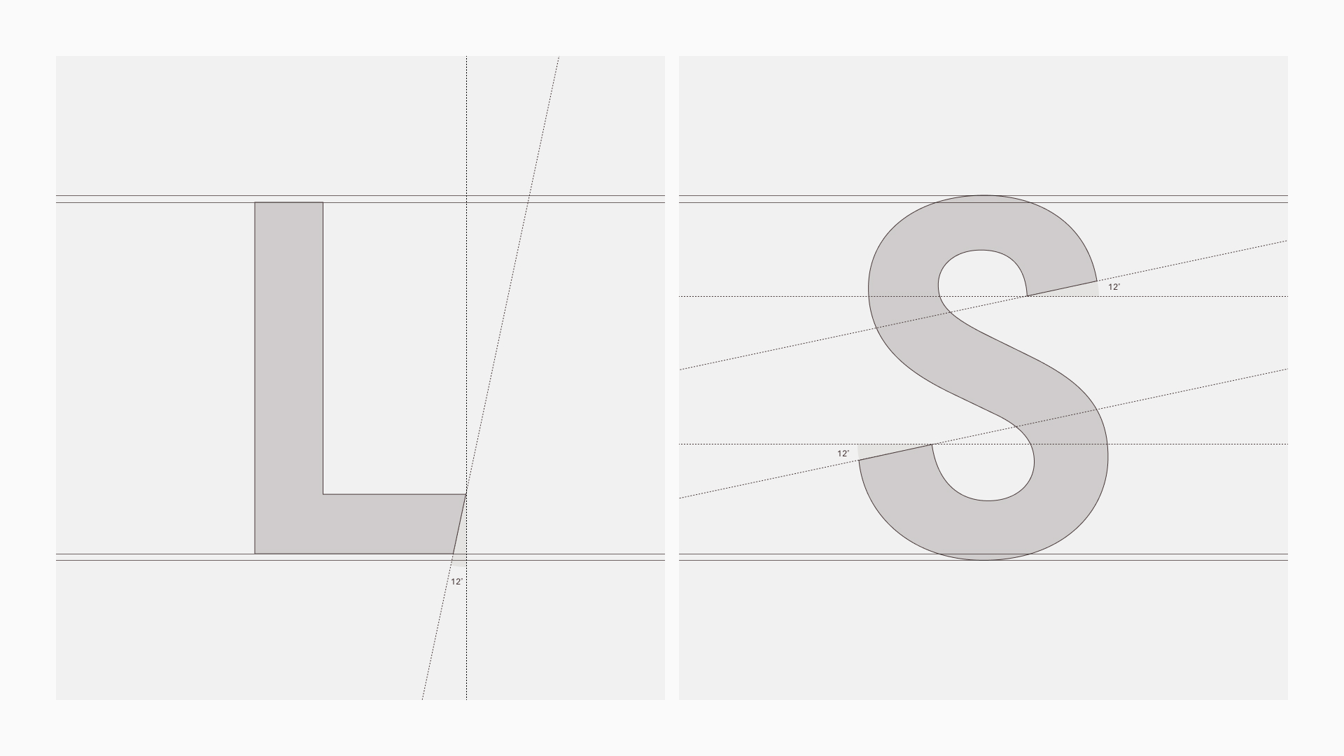
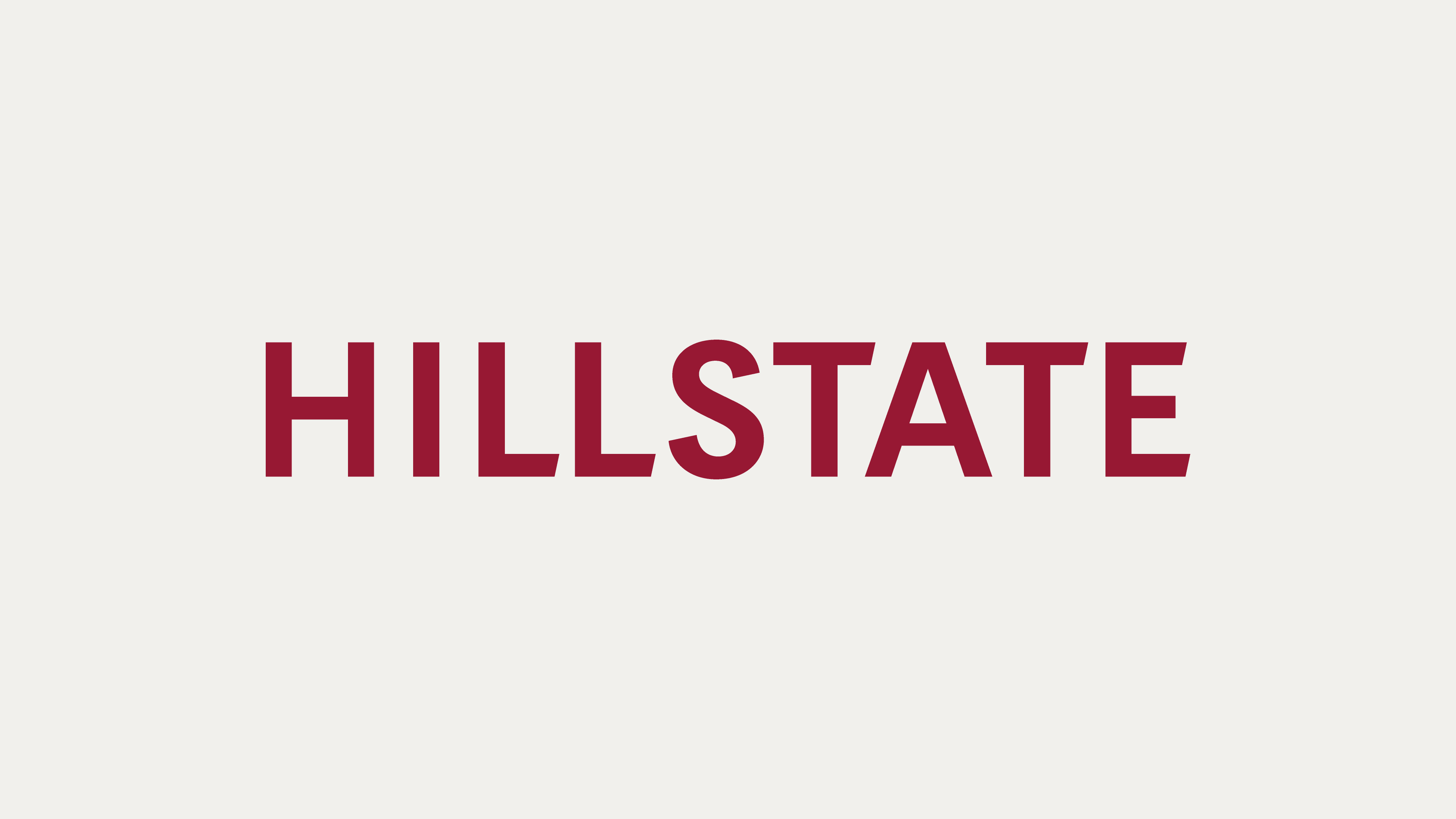
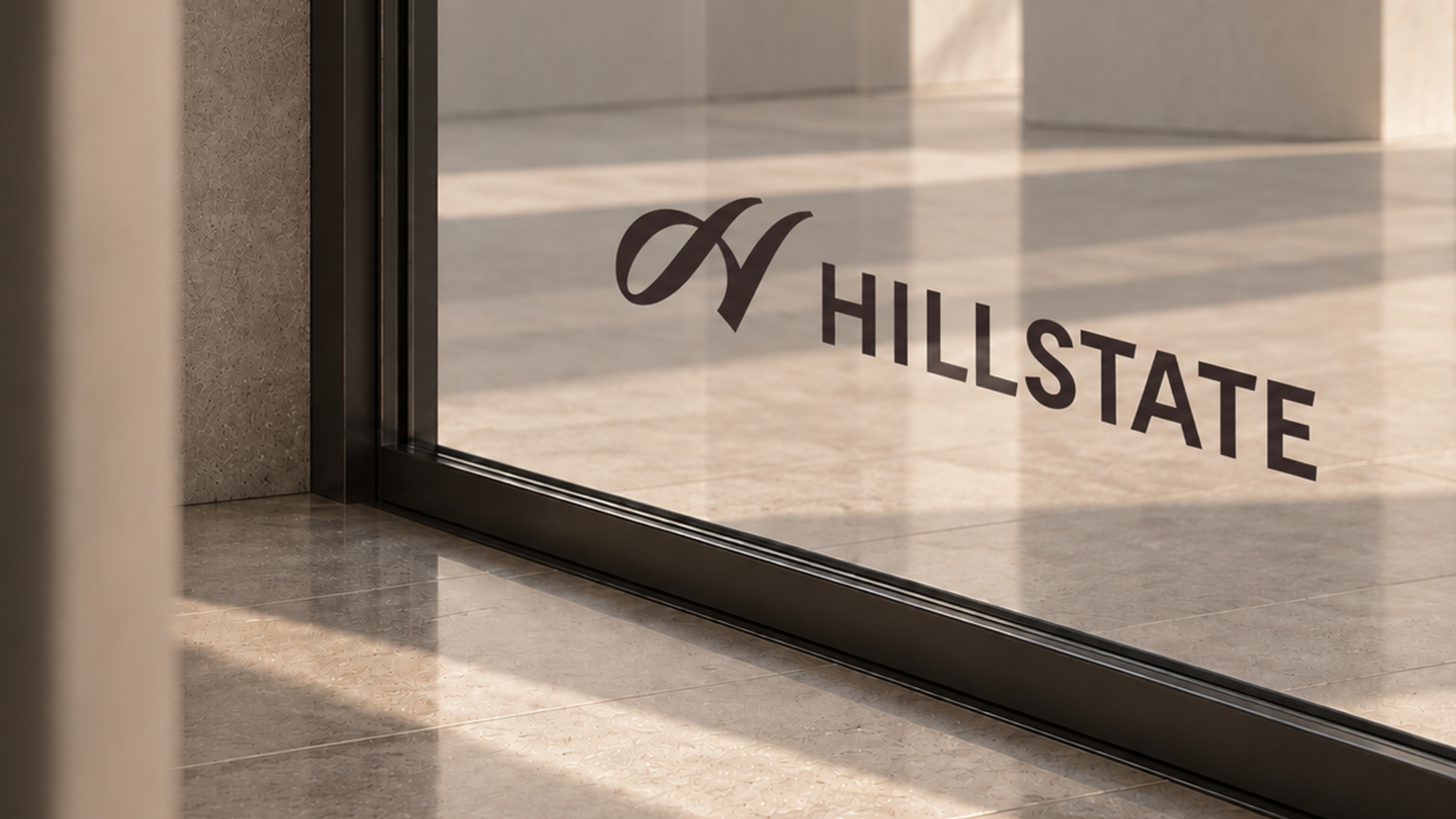
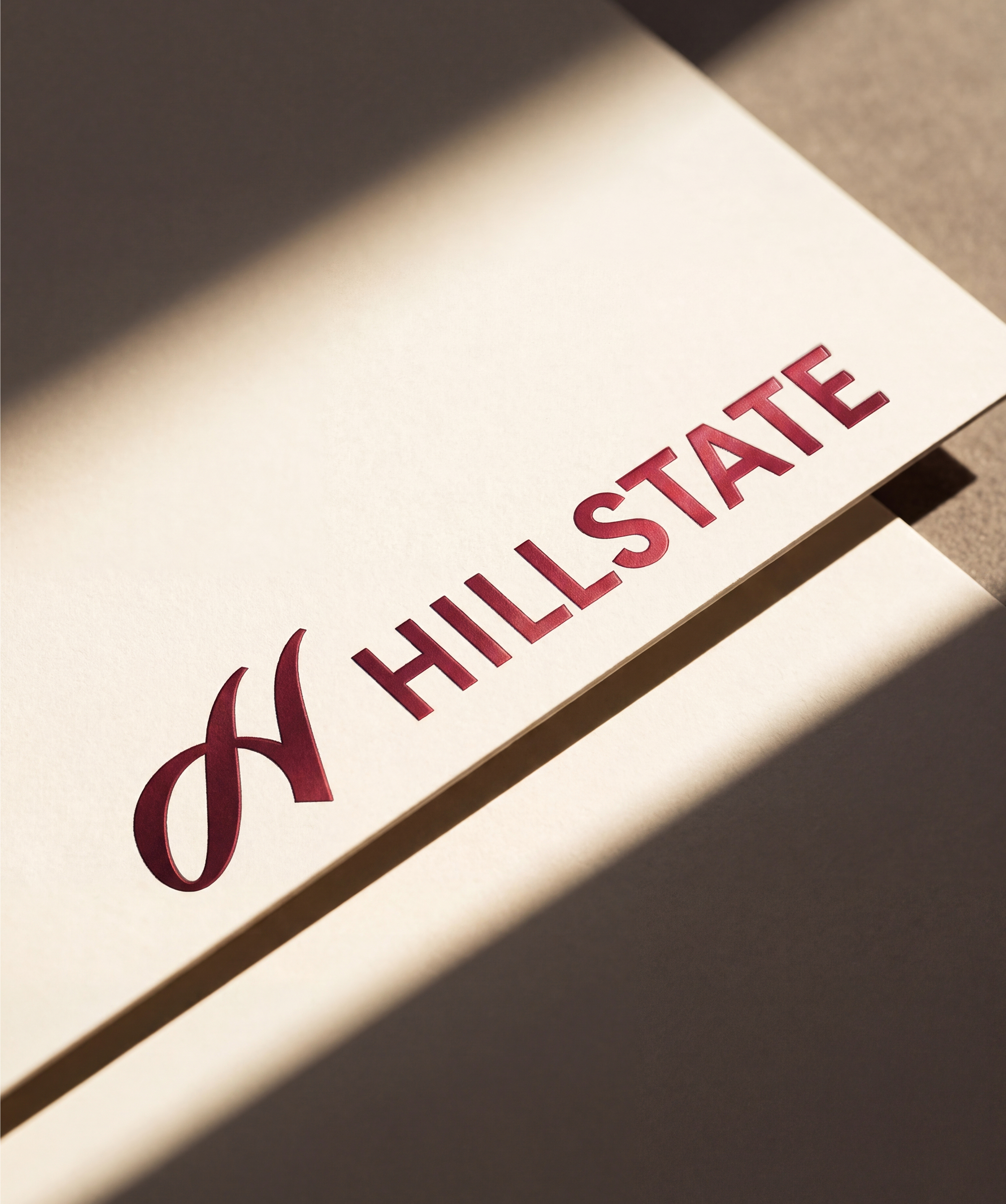
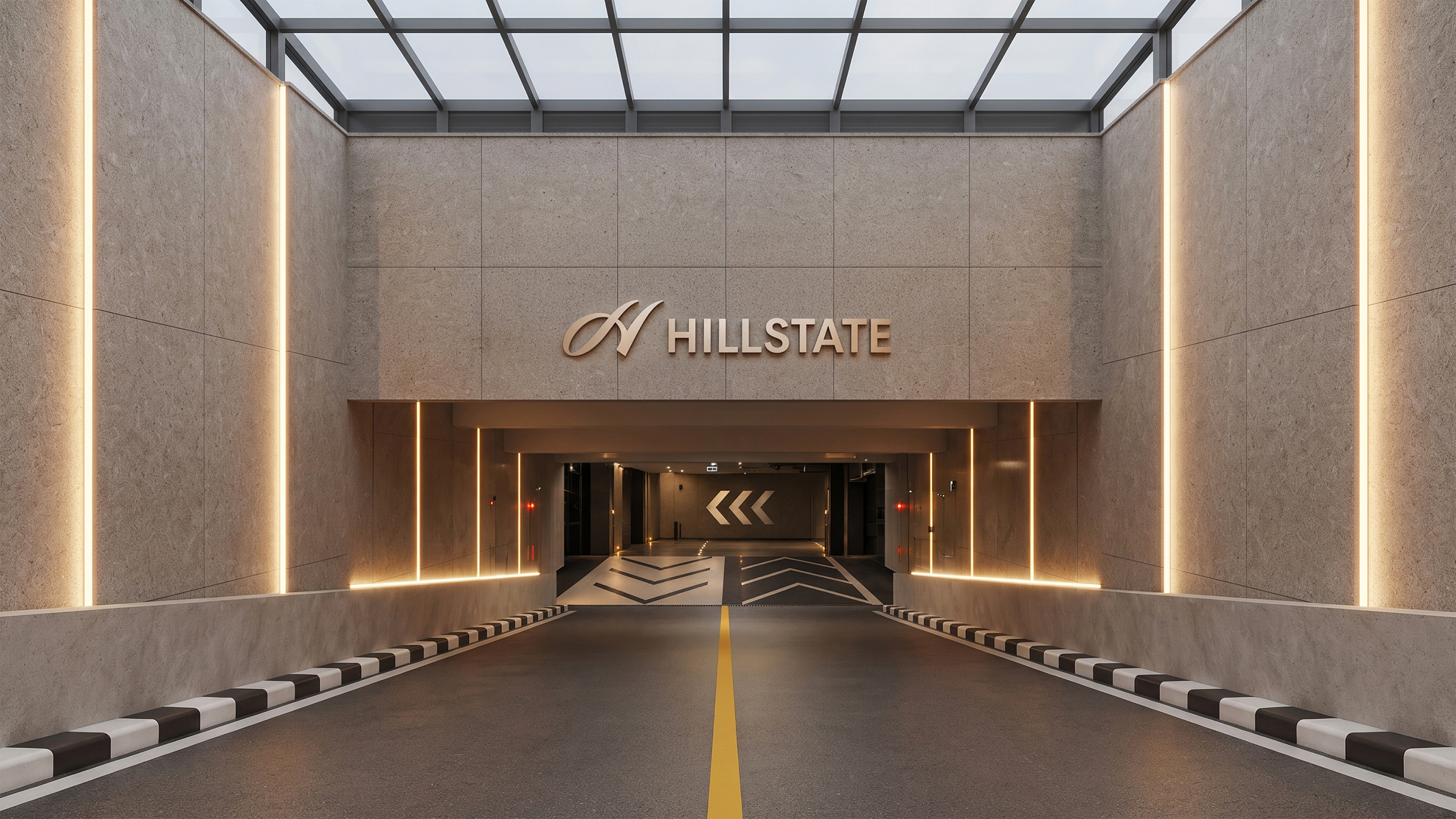
The HILLSTATE logotype is designed to create a harmonious relationship with the symbol mark while clearly communicating the brand name. The symbol’s fluid curves are subtly integrated into the letterforms, creating a natural visual connection between the two elements. Refined proportions and spacing give the logotype a clear and distinctive presence while allowing the curved form of the symbol mark to stand out.
힐스테이트의 로고타입은 심벌마크와 조화로운 관계를 이루며 브랜드 이름을 명확하게 전달합니다. 심벌마크의 유려한 곡선 디자인을 글자 구조 안에 녹여 두 요소가 시각적으로 자연스럽게 연결되도록 했습니다. 보다 정제된 비율과 자간을 통해 선명한 존재감을 드러내면서도 곡선 중심의 심벌마크를 더욱 돋보이게 합니다.


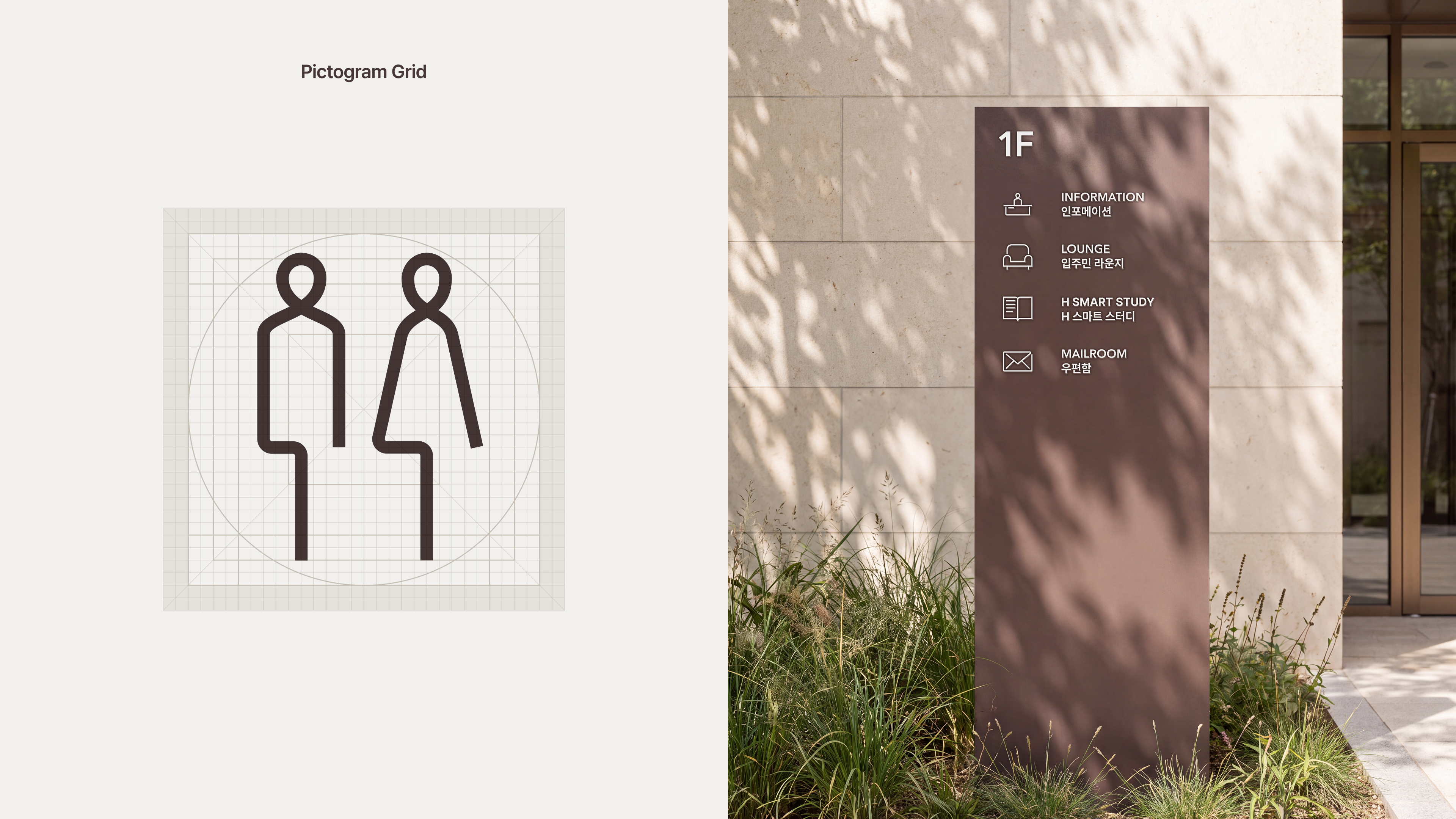
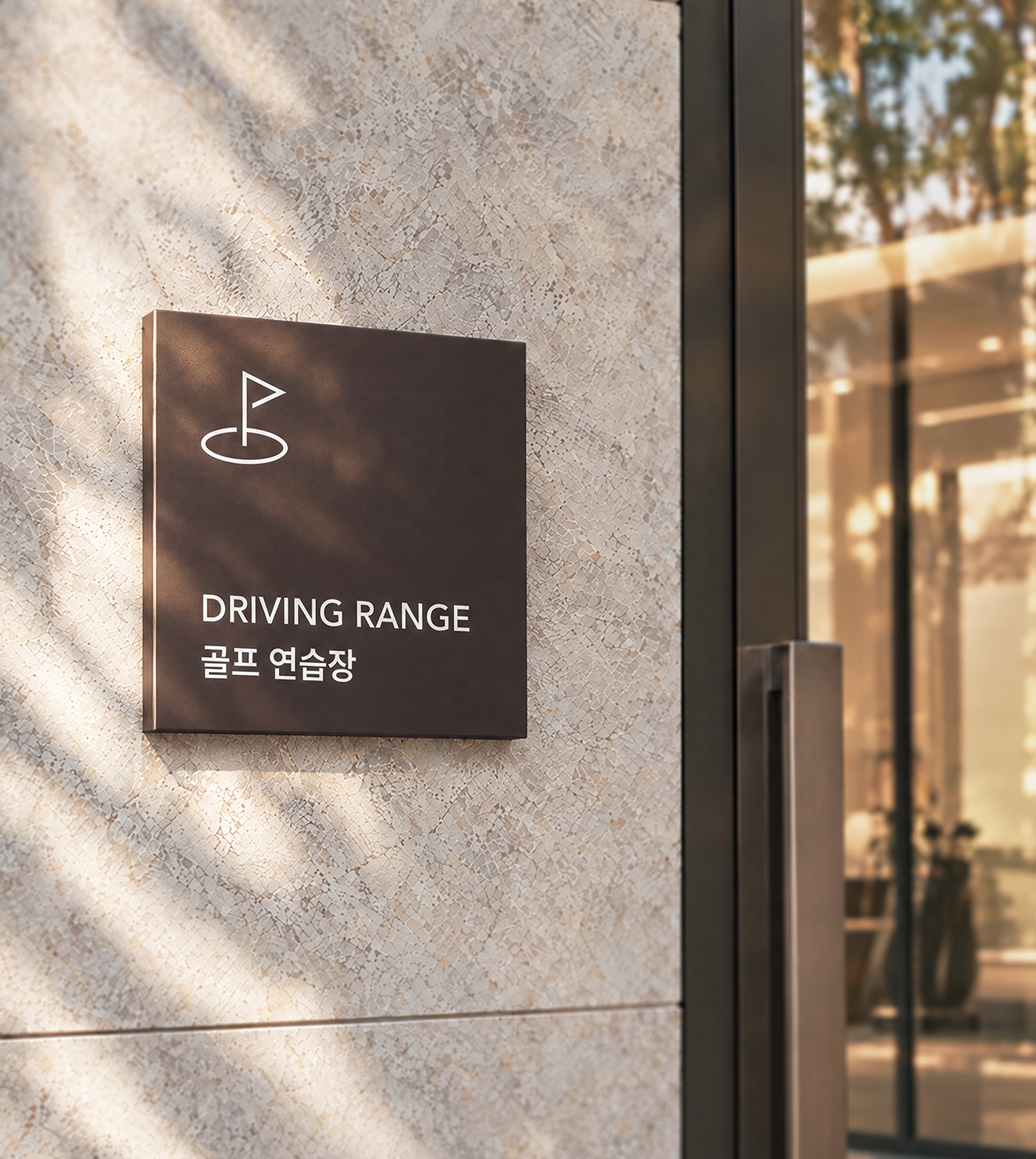
HILLSTATE’s typography combines Avenir Next and Pretendard to create a clear and balanced visual language across both English and Korean. Avenir Next balances a refined geometric structure with fluid curves, while Pretendard delivers Korean text with excellent legibility and a neutral character. Together, the two typefaces create a cohesive expression of HILLSTATE’s modern yet timeless brand identity.
힐스테이트의 타이포그래피는 Avenir Next와 Pretendard를 조합해 국문과 영문 전반에 걸쳐 명료하고 균형 잡힌 시각 언어를 구현합니다. Avenir Next는 정제된 기하학적 구조와 유연한 곡선의 균형을 보여주며, Pretendard는 뛰어난 가독성과 중립적인 인상으로 한글을 명확하게 전달합니다. 두 서체는 조화를 이루며 힐스테이트가 지닌 현대적이면서도 시대를 초월하는 브랜드 이미지를 표현합니다.
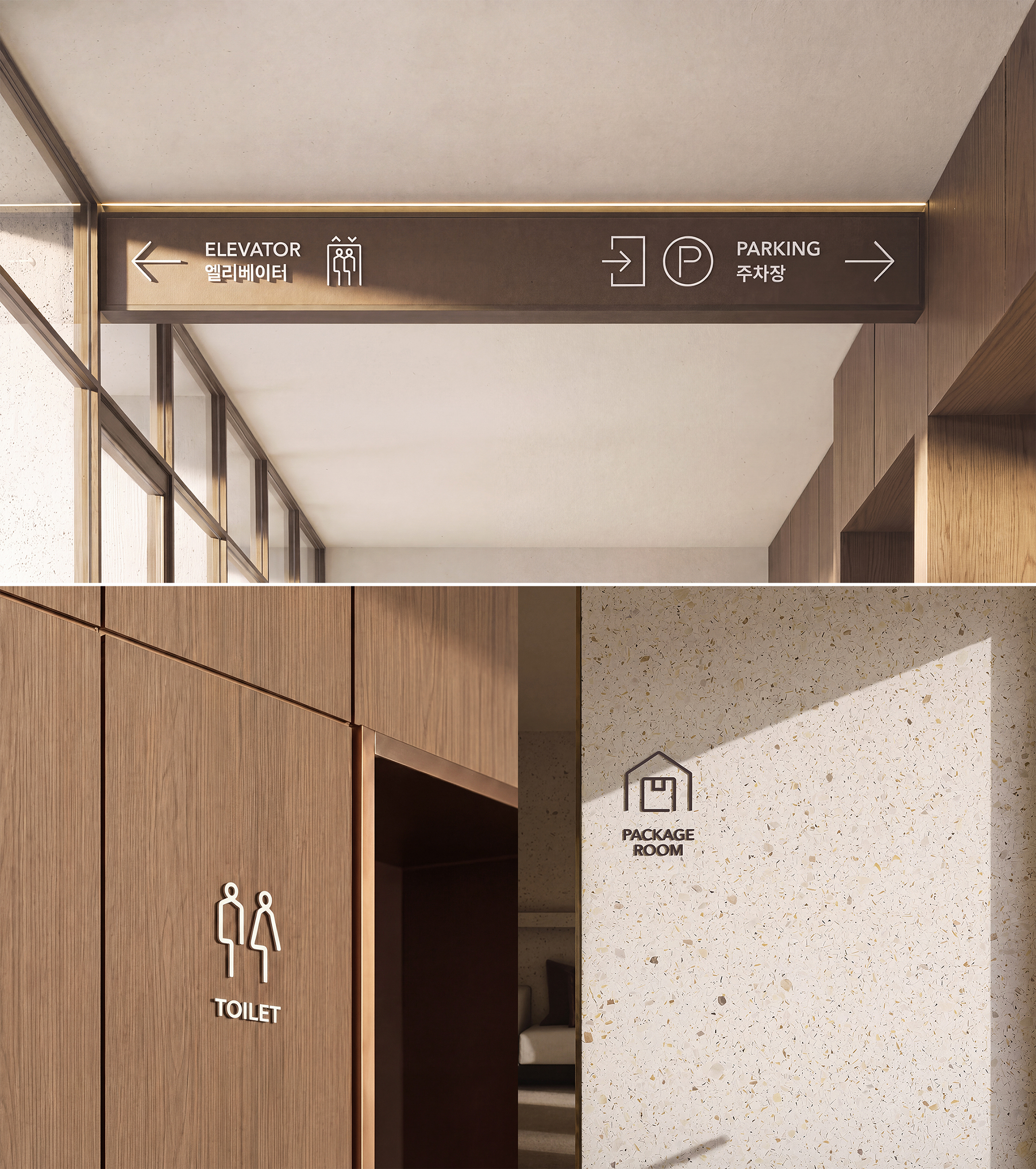
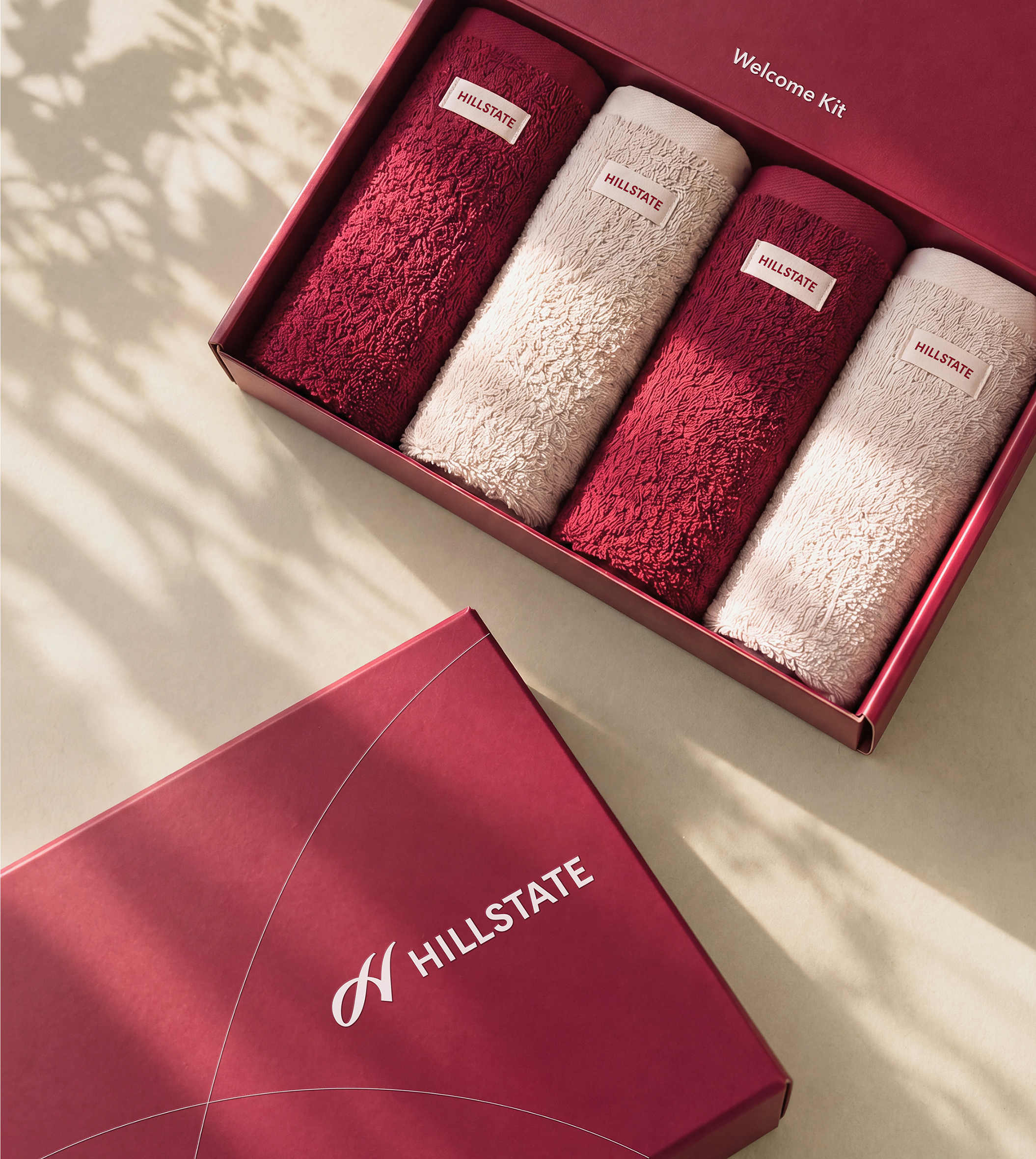
HILLSTATE’s signature graphic motif, the Stylish Curve, originates from the lines of the symbol mark and expresses the brand’s sense of flexibility, comfort, and sophistication through a premium visual language. The gentle arches and rising curves intersect to create a distinctive visual expression that reflects HILLSTATE’s openness to diverse ways of living. Bringing together comfort, inclusiveness, and style, the Stylish Curve defines a differentiated lifestyle unique to HILLSTATE.
힐스테이트의 시그니처 그래픽 모티프인 ‘스타일리시 커브(Stylish Curve)’는 심벌마크의 선에서 출발해 브랜드가 지닌 유연함과 편안함, 세련된 감각을 프리미엄한 방식으로 표현합니다. 완만한 아치와 상승하는 곡선이 교차하며 만들어내는 고유한 시각적 인상은 다양한 삶의 방식을 포용하는 힐스테이트의 개방성을 담고 있습니다. 편안함과 포용성, 스타일을 아우르는 디자인 언어를 통해 힐스테이트만의 차별화된 라이프스타일을 구현합니다.


Creative Director
Jung Kiyoung, Chung Jinsuh
Designer
Woo Juhui, Shin Yeeun
